Even the drips will never be completely uncontrolled I place them and I give them a sense of direction, I to get the paper to balance evenly. This reminds me of my research about OCD, it appears that I have been working in a very similar way. I think that this is something that I should continue to do and research, but as I continue to make my work I need to pay more attention to how I'm making the work and this might give me a indircation to why i'm doing it.
Monday, 17 March 2014
Putting my work into context
Since playing with the inks and then adding the circles I have realised that my work is very much about trying to control a situation. I am creating these large splash marks and then adding the circles subconsciously until i feel that I've controlled the situation enough, until I am personally happy with it. I think that i have been doing this through out the project. I have taken inspiration from artists that suffer from mental illness, but I have come to realise that I am working in a very similar way to these artists.

Friday, 7 March 2014
Gerhard Richter and Kara Walker
Gerhard Richter
 |
| Express- graphite on paper- 1965- 53 X 45 Cm |
Richter is a painter, sculptor and drawer and is also a very
productive artist; he produces so much work every year. However he is now
facing criticism for the fact that it is now becoming to look a bit factory
base creating work for the sake of it, a problem that many modern painters art
trying to overcome and avoid doing. For each different media his work is very
different the painting very abstract, the sculptors very architectural, but
then on the side you have photorealist paintings and drawings that are very
sketchy.
Richter is an artist who likes to explore colour this is
what most of his painting are about loads of different colour combinations,
however at the same time his work seems to have this emptiness there doesn't
seem to be any other form of emotion or anything like that behind it. It's just
colour on a canvas and that's what it is. This isn't as easy in a drawing when
you only have black and greys to play with, they drawings seem to try harder to
provoke an emotion but they just seem a little lost, Richter says that he just
wants to create something that pleases the eye, but then how is his work any
different to wallpaper.
I wanted to looks at some of Richter's drawings to look at
the way that he uses figures and shapes in the work. The drawings are simple
and look as if they have been very quick to do they look carefree, but as I
said earlier lost. They are smudged over the top to almost create a distraction
from the figure its self. Most of the drawings are there to develop his ideas
for his later works. However they don't look anything like any of his final
pieces there is almost a missing link in the work.
Gerhard Richter: Panorama 2011
http://www.gerhard-richter.com/
Kara Walker
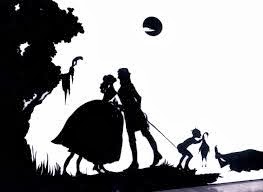 |
| His story never dies |
I wanted to look at Walkers work because of the atheistic connection
between mine and her work. However Walker work deals with very serious issues
to do with race, power and sexuality. These are quite controversial subjects
they bring up issues people don't really want to talk about. She wanted to
follow in the footsteps of her father in becoming an artist it was always what
she wanted to do from a very young age. She became very interested in these controversial
themes when she was at university and when she experienced racism first hand;
he work is very personal to her.
Her work is made our of paper that has been cut out then
placed on a white wall, the scale of these are huge and there is a surprising
amount of detail in these cut-outs. The images that are depicted in the work
are often representational of fairytales, but of a fair more mature type. The
contrast of the black and white against each other isn't just a stab at racism
but it makes the story so much clearer to understand.
Walker wanted the work to provoke an outrage or some sort of
shock she wants to get people thinking, to almost get them on her side. I personally
really like the work and think it's something that you could look at time and
time again and come away from it feeling different. I think that it is
important in my work that I will find something like Walker to drive it
forward.
http://learn.walkerart.org/karawalker/Main/RepresentingRace
http://learn.walkerart.org/karawalker/Main/RepresentingRace
Thursday, 6 March 2014
Tony Cruz Pabon, Kira Lynn Harria
Dove Allouche
 |
| diptych part 1, lead and ink 70 X 100 CM |
When you look at Allouche's work you feel like you are
looking into the dark, you struggle to see what are about and what's in them.
He uses in and pencils to create these images and obviously the palette is much
muted which also suggests that the subject matter is of a dark nature as well.
Allouche says that he wants to try and give as much information as possible
with the smallest contrast in tones.
The forms in the drawings are almost unrecognisable, but
they are of natural wonders created by the weather or space phenomena. Allouche
uses these because they are unique events where nature is in complete control.
However Allouche doesn't just conscribe the images in the way they look he
completely regenerates the picture using what critics call "a syntax of reproductively",
it's Allouche's worst fear to be caller a copyist.
The image is both flattened and intensified when using this
process, and layer upon layer of pencil are built up in areas until you can't
see through parts before the ink is applied. These drawings are made over a
period of several months because Allouche insists that they mustn't be rushed,
he also wants the lines of the pencil to be completely invisible "as if it
was a tattoo onto the paper". The work is very perfectionist and almost
OCD, the work is very rich and intense because of the materials used. I think
that the artist wanted the process to be the most important part of the work,
it is more of a process art piece and maybe viewing this process would allow me
to understand it more.
Tony Cruz Pabon
 I wanted to look at this artist because in my drawings there
is a specific use and play on space which is the same as in Pabon's work. His drawings
are mainly made up of lines which represent the distance between two different
points. These can be two different locations, a literal space or anything, but
the idea is that they show a journey in-between the two lines. The drawings are
very literal, the lines clearly show space and distance and I think that the
artist does this to show the simplicity of what his art is about.
I wanted to look at this artist because in my drawings there
is a specific use and play on space which is the same as in Pabon's work. His drawings
are mainly made up of lines which represent the distance between two different
points. These can be two different locations, a literal space or anything, but
the idea is that they show a journey in-between the two lines. The drawings are
very literal, the lines clearly show space and distance and I think that the
artist does this to show the simplicity of what his art is about.
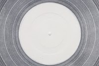
The work is obviously very abstract and is very far away
from its literal form and it must be quite a process to get to the final
outcomes, one of the drawing is a representation of the groves on a vinyl
record which when you know what it is it becomes obvious, but it's something
that you would have never have guessed. As well as drawings Pabon is also a
printmaker making large intaglio prints, which look very much like his drawings
as you can see from the picture. "Distance Drawing" is described as
an attempt at drawing the distance between San Juan and London, which makes you
thing that it wasn't successful.
Pabon wants there to be a feel of distance in his drawings
and perspective, as if something is a long way off and they aren't sure how to
get it, he says he wants people to feel despair because they can't get what
they want and they can't do anything about it. I personally like the work
because of the ideas behind it, but also because of the muted colours.
http://cargocollective.com/tonycruz-portafolio/C-V
Kira Lynn Harris
 |
| City room, Chalk and emulsion |
I wanted to look at Harris's work because of here use of
perspective and monochrome colouring. Harris
wants to unpin the viewer's sense of space by using multipoint perspective to
create the illusion of indoor and outdoor space. This causes you to question
perception of what is actually in the room. Harris uses black paint and white
chalk to create the drawings so they resemble chalk on a black board which give
you the impression that she is trying to teach us something but also
questioning the mental age of the audience. She can erase them at any time and
start again which makes her work quite playful.
She has been influenced by many things as there is such a
large variety of forms in the work; however some of the most key influences are
space and light architecture, renaissance art and even Rothko. Sci-fi has been
a major influence because it embodies her idea of movement, space and time, but
you can't see any particular influence of sci-fi in the work it all looks very
real and realistic. You can see that in some of her work there are figure that
each of their own little story and this is where the influence of sci-fi comes
in you have to read into the work description to really figure out what's going
on.
Harris likes to tell a story in her work, the work is more
illustrative than it comes across and it is encrypted in the work, it is a
challenge to figure it out. Harris says that simply writing her stories aren't
enough and she needs to draw her ideas to make them come alive. I like the work
because of the perception and perspective that is in there, but also because of
the space and depth in the drawing this is something that I would like to
create in my work.
http://www.re-title.com/artists/KiraLynn-Harris.asp
http://www.re-title.com/artists/KiraLynn-Harris.asp
Wednesday, 5 March 2014
Tauba Auerbach
Tauba Auerbach
 |
| Untitled fold- 2011- 162 X 122 Cm |
Auerbach isn't afraid to use several disciplines in her work
like many of us in this generation of modern artists. She clearly has an
influence of graphic design in her work as you can see; there is a clear
structure and geometry to her work.
There is a refined sense of detail and perfection in her work. Auerbach
has always been a painter even though even her earliest works have been
influenced by graphic design. She says that art doesn't restrict her in the way
that graphic design does, and allows her to play on things in particular words
and letters. Such as in her "the Holy Bible" project where she placed
all the letters in the Bible in alphabetical order, when asked what inspired
her to do this she said it was to see the unordered letters together in
something that was sacred and untouchable. It's like she is rebelling against
being conventional like many artists.
Her most recent work is now more playing with visual
illusions and the way people see things, where she has created bodies of work
called "folds" and "Crumple" paintings that are meant to
look as if the canvas has been manipulated which it has, it has been spray
painted while folded and then stretched out. One of the things that are really
effective about these paintings is the fact that you have to stand about 25
meters back to get the full effect on what they are trying to show you. There
are creates using both painting and printing and the method that is used is
called the half-tone process. I find these abstract paintings quite beautiful,
they have a gentle feel to them even though the shape black and white should
make them really fierce and the size of them rather intimidating.
I think that Auerbach's work is really interesting and I
think that I would like to experiment with folding up the canvas and then maybe
applying the ink to see what shapes and effects I get to develop my work.
Vitamin P2
http://www.taubaauerbach.com/bibliography.php
Vitamin P2
http://www.taubaauerbach.com/bibliography.php
Second Body of work final piece
 |
| ink, acrylic, marker and biro large development 350 X 150 Cm |
 |
| Example of Tauba Auerbach's work |
This gave me the idea of folding and ironing the fabric then
painting the circles on the folds before opening it out and stretching it. I
did a few of these on paper to test out the idea and it seemed to work really
well, it created some really interesting patterns which I could then draw my
circle patterns onto. For the rest of the week I decided to continue finishing
my last piece before moving onto this next body of work.
Developing Second Body of work Further
I have started the week by creating a very large scale
drippy painting with the inks which to capture the process I created a film of
me creating it, this will help me develop my work and the process behind it to
create some more successful outcomes. The shapes that have been created in the
work are really interesting, but I really like the way that it has dried in the
middle the patterns reflect the stages in which it dried which also show the
process.
Because of the scale of it I decided to do it in different
sections which again to me makes it more interesting because while working on
one you cannot see the others so you can't tell if you process has slightly
changed or if it looks the same, which is something that I really like because
you will probably became to see the progress of my refining process by the end
of my piece.
my video on process art
http://www.youtube.com/watch?v=Lf-0P9RIAlU
Ignacio Uriarte, Process art, Chris Drury and Niki de sant Phalle
Ignacio Uriarte
 |
| Bic Cycle- 2010- each 65X65cm |
He says that most people will doodle at work and he has taken this to a whole new level, but has kept it in such a controlled way that it becomes something else. He argues that most artists actually will spend most of their day at a computer the same as someone who works in an office. You can see that there is a clear influence between Uriarte's work and Frank Stella even Reinhardt.
He uses normal biro colours that are produced, but you can see that there is a pastel pallet that is deliberately chosen to keep his work as minimal as he can, but to also give it a very gentle feel to it. From a distance you can barely see what it actually is made up of this is something that I would really like to include in my work.
http://www.ignaciouriarte.com/
http://en.wikipedia.org/wiki/Process_art
http://www.ignaciouriarte.com/
Process art
This week I
have decided to look at process art because it ties in so well with my project.
This is an art movement where the actual finished article of work isn't the
most important part of the work it is the concept behind it. I is what the actual
craft of it behind it is important, this can be from the patterning to the
gathering of the materials to make it.
This movement
happened in the 1960's and has been popular in Europe and America; it is
thought to have come from performance art because the two have very similar
concepts. However it is also very similar to aboriginal art for an example,
which predates any modern art in a long way. Some people argue that any art
could be classed as process art, but in my opinion I think that there is a fair
reasoning to this because anything has a process to getting to the final
outcome, but this form of art does have more of a story it provokes the viewer
to think more about it if they want to appreciate it.
http://en.wikipedia.org/wiki/Process_art
Chris Drury
 |
| Rhine Mosel Slate Whirlpool- 14 X 14M- 2010 |
Chris Drury
is a progress artist who is inspired by nature and its forms, most of his work
is very organic and at one with nature. His work comes in many forms them being
paintings, land art and sculpture. He says that his work is about the
connections between culture and nature and how they can work in unison or
clash. He is very serious about his work and doesn't want to get anything wrong
so he works with technicians and scientists to make sure that the work is scientifically
correct. It is also an interest to him he likes to understand science, it's all
part of the process.
Drury often collaborates
with institutions, he wants people to know and understand his work, and he doesn't
just want them to see the finished articles of work. This is one of the reasons
he creates videos of his work. He is obviously inspired by nature, but there
are other key inspirations such as Henry Moore, Andy Goldsworthy and there is a
clear connection with aboriginal and cave art in the work. The link with the
Aboriginal work is very clear in the land art it is created in the same
circumstances as the aboriginal art; outside on the ground looking up to the
gods.
I like the
work because of the link in with history and the patterns that are involved with
the work, I also like the way that is fits right into the landscape and a lot
of them aren't permanent. I think that like Drury I need to start taking videos
of the process in my work for people to see how it is made.
http://chrisdrury.co.uk/about/artist-statement/
http://chrisdrury.co.uk/about/artist-statement/
Niki de sant Phalle
 |
| shooting picture Tirage-1961
1430 x 780 x 81 mm
|
I was looking specifically at her shooting painting as the
way that the paint has moved is very similar to the way in which I have been
conducting my ink to move. This is a form of process art and the process is very
important to Phalle as it was just after the war. She actually stopped creating
these works in 1963 as she felt that she was now getting addicted to shooting,
she said it was like a drug to her.
The paintings were created just after the second world war,
which is quite significant considering that there was a gun used to create the
work, this suggests some sort of nod towards the war effort, it wasn't until
the 1960's that she started to make this work up until then she worked in collages
and oil paints, before moving into sculpture briefly before these works started
being created.
This shift in her work happened when she visited Paris and
saw an American exhibition that included the likes of Jackson Pollock and De
Kooning. She had a good friendship with Jasper Johns who is famous for his
"Target" paintings which undoubtedly is a key influence of Phalle's
work. Phalle said that she found these works exciting because of the way that
the ink might or might not fall; you never know quite what's going to happen.
In time you are bound to learn what might happen, but the fact that different
people are shooting each shot makes impossible to know, but also gives Phalle
no control over her work it is more of a performance.
http://en.wikipedia.org/wiki/Niki_de_Saint_Phalle
Subscribe to:
Posts (Atom)